


Our Studio was commissioned to design a premium packaging solution for Eteo Olive Oil.
The inspiration for creating the brand identity has its origins in one of the most genuine eras of antiquity. Homer, “the greatest poet of them all”, used the word “eteos” (ἐτεός in Greek) to describe the native, true, genuine inhabitants of the island of Crete, the Genuine Cretans: the Eteocretans. The name Eteo is a way to show the origins of the olives grown in the region of Eastern Crete, where the Eteocretans lived some 2,500 years ago and collected olives to produce precious olive oil.
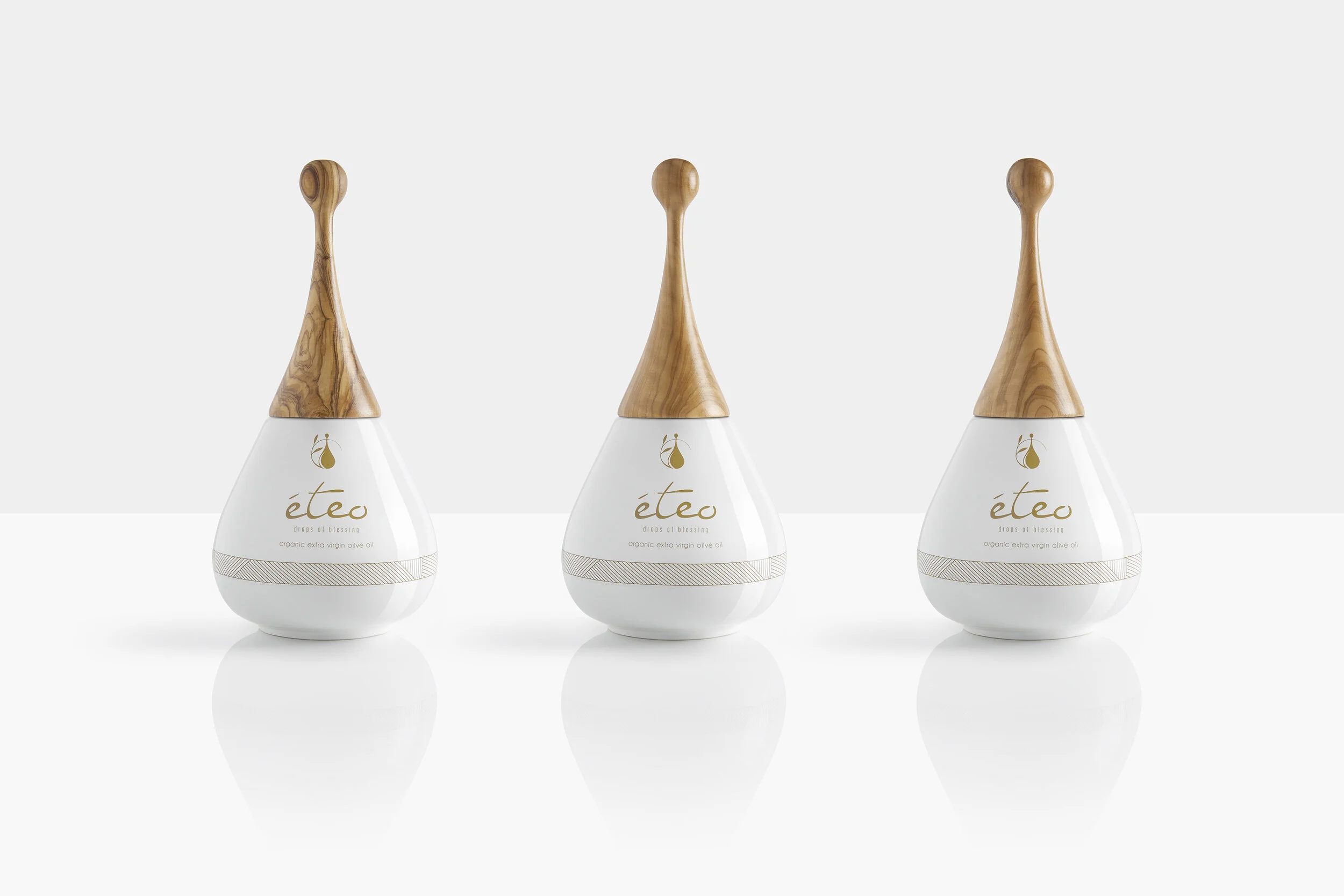
The brief was to create a unique packaging made of ceramic, for an extra-premium product that will stand out on the shelf and reflect the high value of its content.
Considering the brand’s tagline, “Drops Of Blessing”, the design of the bottle resembles the organic shape of a drop. The use of two genuine elements — porcelain and olive tree wood — borrowed from Mother Earth and brought into harmony with one another, are creating the ‘perfect drop’ shape of the Eteo bottle.
Packaging materials were chosen for their practical and symbolic characteristics. Ceramic offers the best protection from direct sunlight, air contact and everything that could compromise olive oil quality, and it comes as no surprise that it has been used for properly storing olive oil since ancient times. The bottle cap is made of olive tree wood, an underutilised and yet so interesting material, with complex grain structures and colours ranging from cream through pink to black.
The combination of these two materials creates a playful contradiction between the sleek white ceramic bottle and the polished wooden cap, resembling the eternal blend of earth and trees that provides the valuable olives.
Awards:
International Design Award 2016, Print Packaging Category
London Olive Oil Awards 2017, Gold for Total Image / Gold for Innovation / Silver for Label
Credits
Creative Direction / Product Design: Aristotelis Barakos
Graphic Design: Vaggelis Katanias
Photography: Giorgos Vitsaropoulos